Decorating Mistakes That Make Interior Designers Cringe. Does your home feature any of these design mistakes? Find out how to avoid this familiar faux pas with a few simple solutions from design experts.
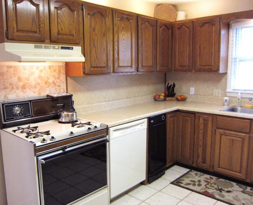
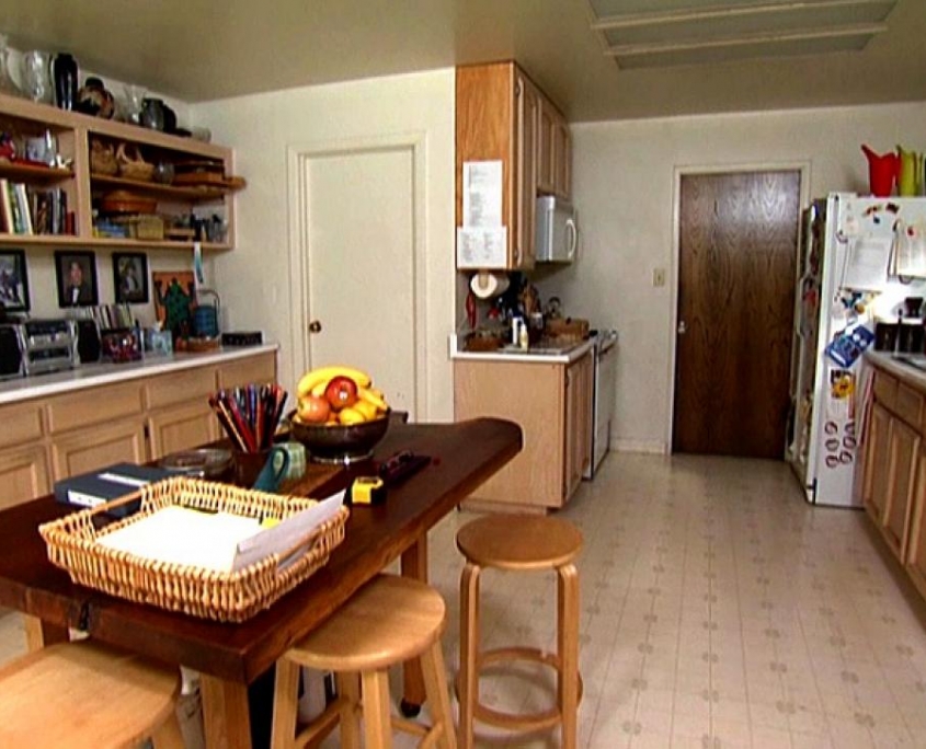
Mistake: Mismatched Appliances
Appliances in a mishmash of finishes and time periods.
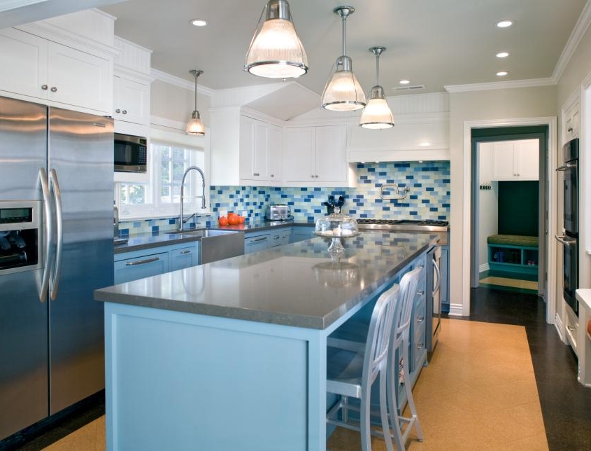
Solution: Make Appliances Cohesive in Finish
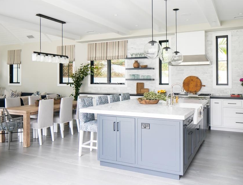
Kitchens are about togetherness, and design choices should reflect that. Stainless steel appliances and chairs give a modern touch to this bright, contemporary kitchen. “Regarding the appliance finishes, I’d say the most important aspect is cohesion in finish,” says architect and designer Jeff Troyer. “I don’t necessarily need to use the same brand of appliance, but a matching finish is important.” He offers one more tip: Make sure that when using different brands of appliances that the handles match.
Mistake: Ignoring Lighting
Kitchens are lively spaces, so a designer pet peeve is when lighting is an afterthought.
Solution: Use Different Types of Lighting
Use both overall light and task lighting in a kitchen. Try to make sure that function matches form and create beautiful spaces. Also, undercabinet lighting is a must.
Mistake: Stencil on Walls
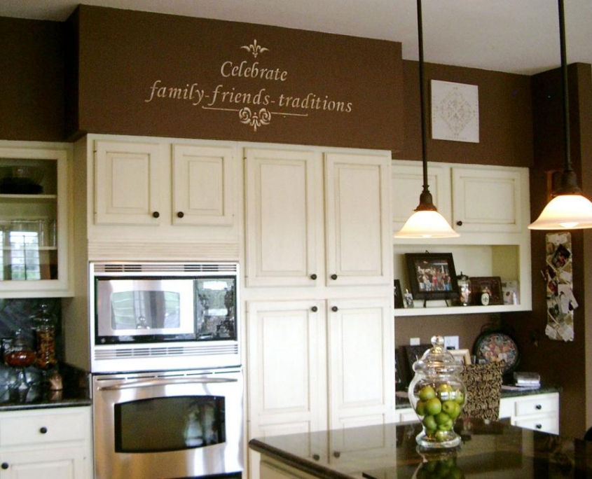
Much of the kitchen design is focused on the cabinets and functionality, but when homeowners rely on stencils, designers would love to show them how they can do so much more with that space.
Solution: Curate a Collection
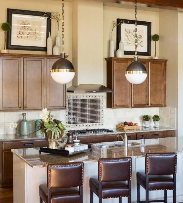
Incorporating something unique in the open areas above kitchen cabinetry is much more of a statement than a trendy wall decal or “cutesy” words, say the designer. Whether it be a few pieces of art that bring the rest of the kitchen together or a gathering of several vases or ceramic pieces, the options are endless.
Before: Bland Dining Room
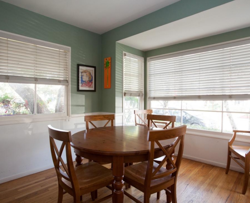
A small, plain space with poor lighting is in need of a re-design because it presents a missed opportunity. The dining room and kitchen spaces can be challenging when it comes to adding color and pattern because they rely on durability and function first.
Solution: Bold Art and Furniture
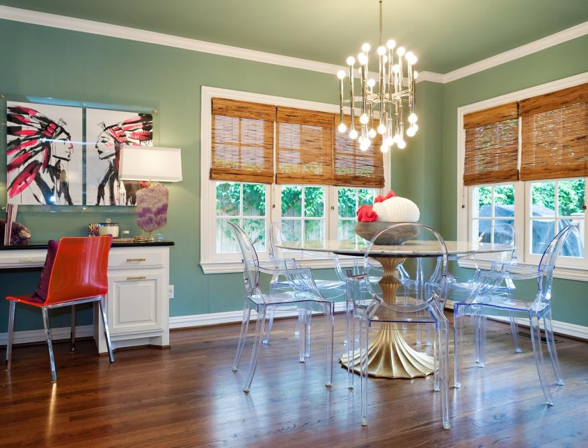
Paint the room — and even the ceiling— a subtle color and allow that to be the jumping-off point for your color palette, the designer says. Art is a great way to bring in texture and pattern, and large scale pieces look fabulous in small rooms and will make them feel larger.
Think outside of the box when selecting your tables and chairs. Dining sets don’t have to match and once you find pieces you love, compliment them with something in a similar style or upholster your chairs with a bold indoor/outdoor fabric for a pop of pattern and color.
Mistake: Unorganized Open Shelving
Open shelving is an up-and-coming trend, but in this pre-makeover kitchen, the effect is just messy.
Solution: Gather Items to Show Off
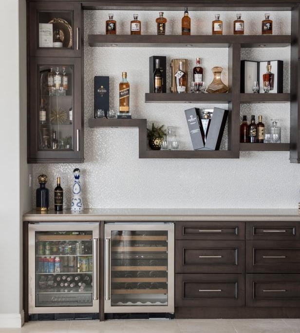
Consider how to display a collection, such as exclusive and upscale liquors on this asymmetrical shelving. Designers consider the style and arrangement of the shelving along with what will be spotlighted to create just the right look.
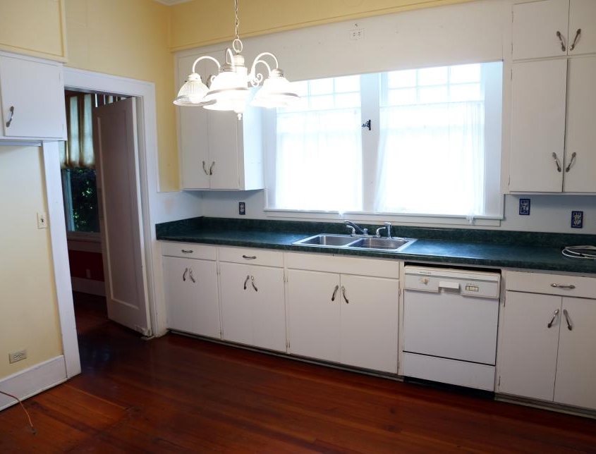
Mistake: Overshadowing Windows
Windows are a beloved feature in a kitchen, but some homeowners tend to overlook them.
Solution: Employ Roman Shades
Mount Roman shades above windows to give the illusion that the windows are taller and more expansive, says the designer.
With the many benefits of updating your kitchen, we encourage you to contact us to speak with our KSI kitchen experts.
We are offering a free consultation for your plan and budget control. We can sit down with you to discuss your vision for your kitchen.
Whether you’re looking to make the necessary updates to increase the marketability of your home, increase the functionality of the room, or create more storage space to help with organization, we can help you create the kitchen of your dreams.
