Darker colors such as emerald green, cranberry red, and navy blue can really make a statement on kitchen cabinets, but they work best in large spaces since they can darken small rooms. If you plan to use them in a tiny kitchen, make sure to balance them out with white walls and lighter accents.
The sky is really the limit when it comes to kitchen cabinet colors. If you’re drawn to neutrals and more colorful shades, incorporate both by creating two-toned cabinets. The trick is to put the light color on top and a darker one on the bottom to help ground the space. Try this combination with white or gray cabinets on top and yellow, blue, green, or red cabinets on the bottom.
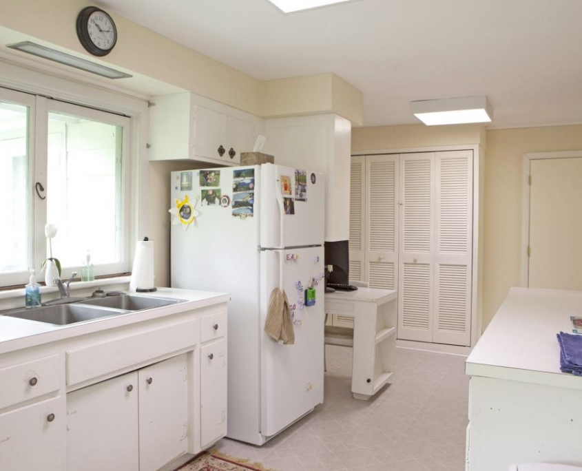
Before: Boring Big White Box
The list of design crimes: Barely any cabinet space, the awkward peninsula cabinets that chopped the room in half, broken oven, nasty peel-and-stick floors, and fluorescent lighting
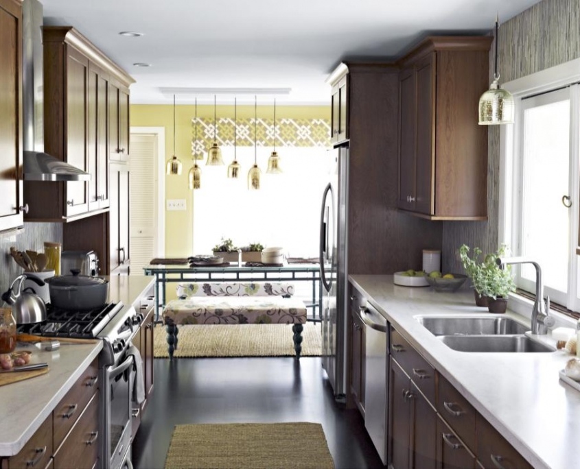
After: Much Smarter Space Planning
Meg didn’t tear out a single wall, but it sure feels like she did! By lining everything up on two facing walls, the layout is a lot less cramped. Meg’s tip: “Countertops on opposite walls shouldn’t be more than eight feet apart,” she says. “Any wider and you’ll want an island in between them.”
Sleek Storage
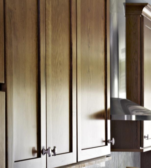
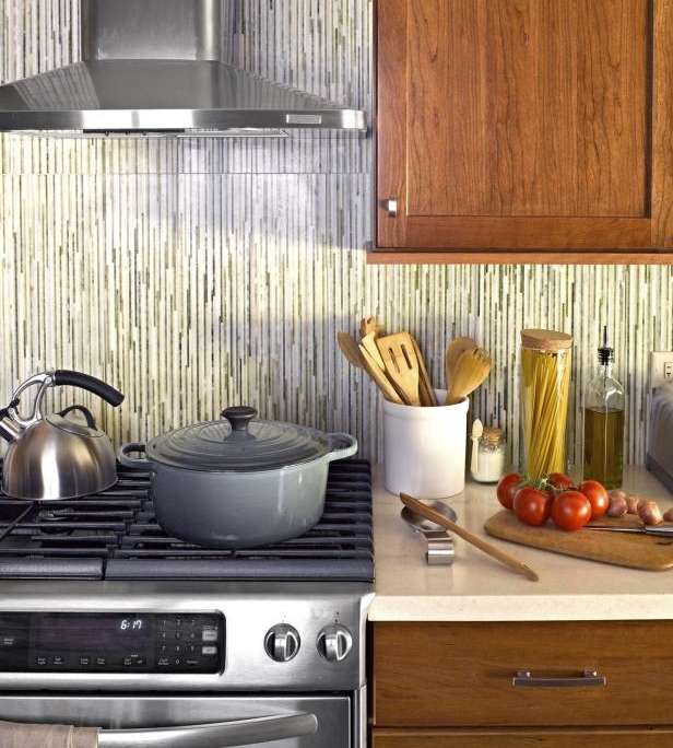
For the cabinets, Meg paired rich cherry wood with modernish nickel knobs. Find solid wood shaker cabinets at KSI Kitchen Solutions.
Invincible Countertops
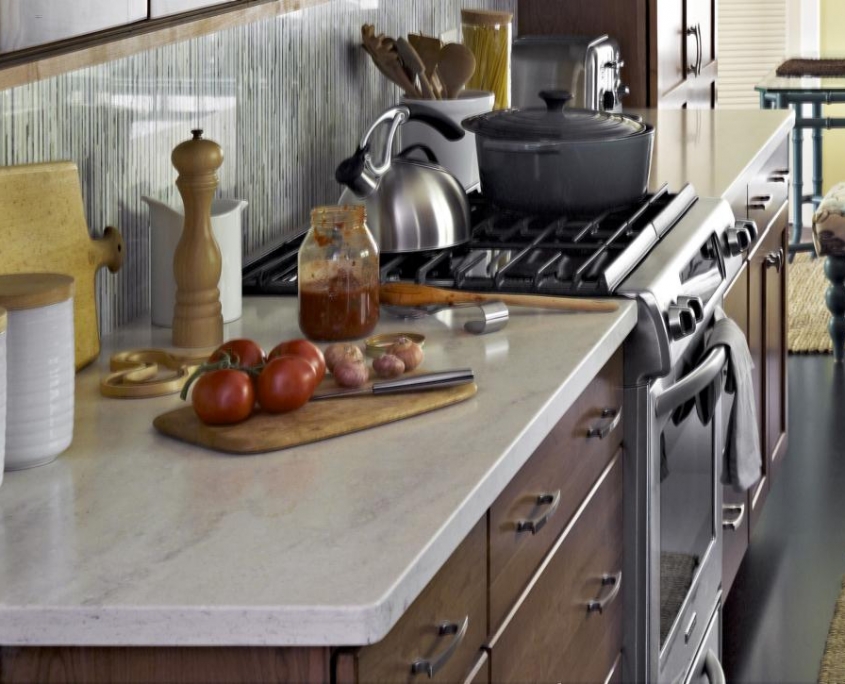
The smart selection: off-white Corian that looks like marble but won’t stain.
Cushy Floors + Durable Pretty Furniture
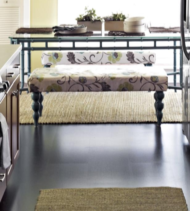
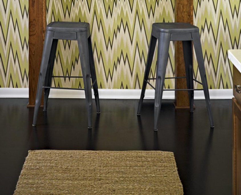
Meg picked dark-stained cork for the floors. It’s warm and sound-absorbent. “It feels like you’re walking on gel!” she says. The dining benches can take a beating and keep on seating. Meg gave the floral fabric an iron-on vinyl coating so they can be cleaned with a Windex wipe-down after meals.
Glam Lighting
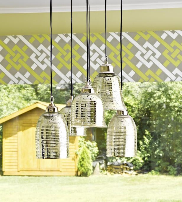
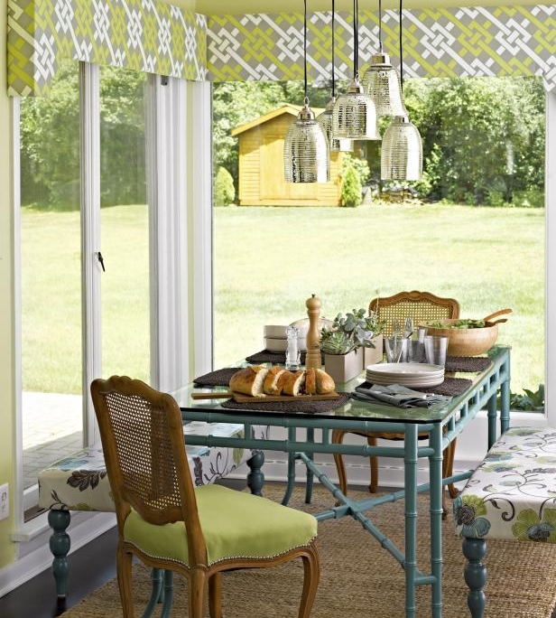
Meg created a custom fixture by hanging a cluster of mercury glass pendants at different heights over the dining table. “It makes the room shimmer,” she says. A leftover pendant was suspended above the sink.
Unexpected Stripes
Thinking outside the box, Meg flipped the funky glass tiles to run vertically along the backsplash. Little change, big impact!
No-Limit Mixing
Forget dining sets (so The Price is Right!). Meg prefers to mix styles and materials, so she pulled up a pair of cane-back wood chairs and upholstered benches to a painted metal table. “These are the kinds of risks that add personality to a room,” she says.
Hide-and-Seek Window Shades
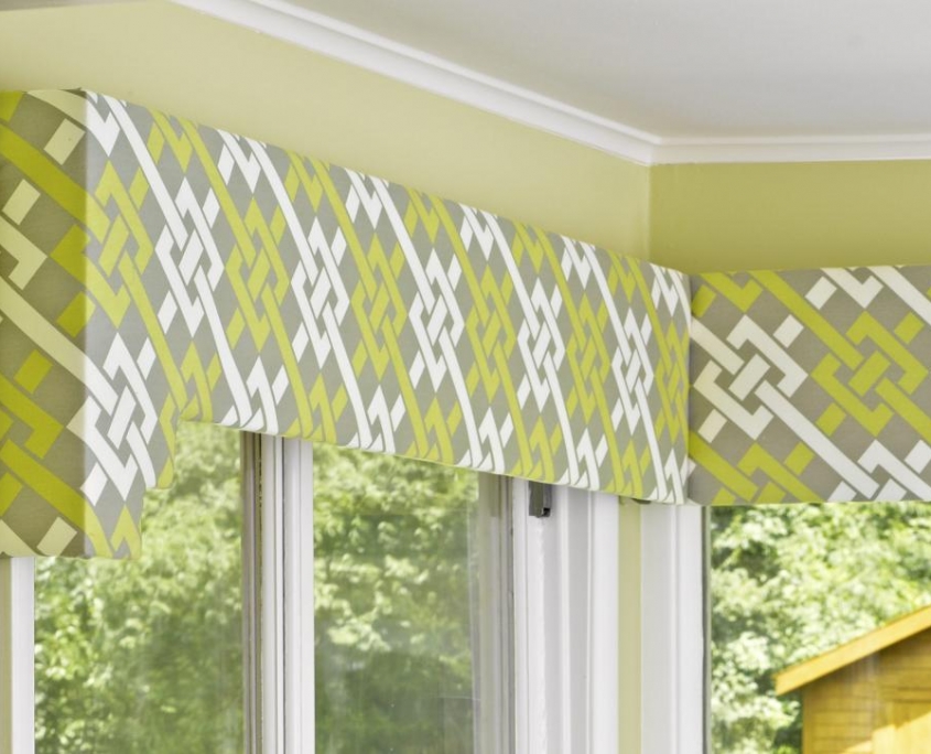
Custom valances made of plywood and supercute fabric cover the blinds, which drop down for privacy.
Multi-Functional Space
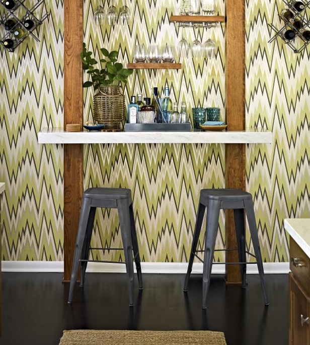
It’s art. It’s a bar. It’s both! You have to love a house that says, “Help yourself to a drink.” Meg amped up the kitchen’s bar area with zigzag wallpaper and floating shelves.
